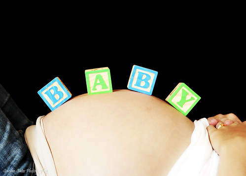
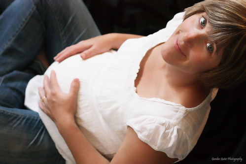
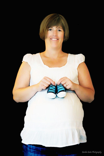
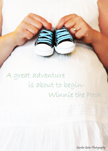
I am so proud to say I had the chance to do my first maternity shoot. Mrs. W was gracious enough to let me give it a whirl. I ran into some unexpected issues that I could not resolve on the spot. First off, I need a wider black backdrop for more than two people. So, I hope my editing the back drop in looks realistic. Second, I could not get as much of every ones bodies in as I wanted cause I couldn't move far enough away in the room I was in. I could have used a different lens, but there was no way I was taking off my 50mm!!! I need to learn to slow down more and not allow my thoughts to jumble. Thankfully I had written a list down. I need to take the time to look at my view finder after each shot. I think I did better on keeping a consistency with my color balance. What do you say? Now, I will critique myself.
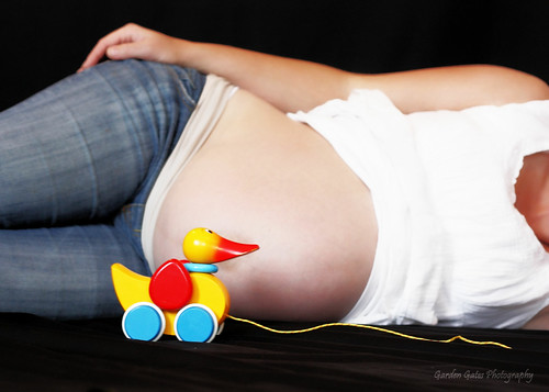
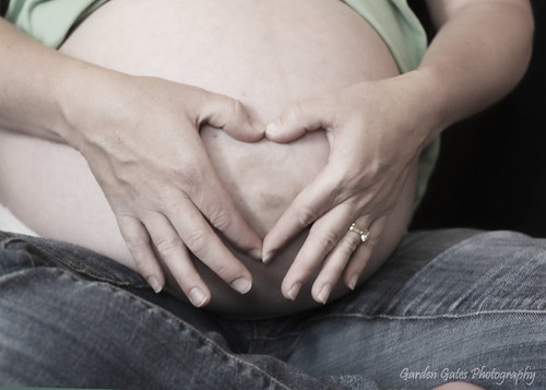
I like this shot. I had to edit in more white blanket cause I didn't have enough laid out for this angle. I am not content with the lighter color on the bottom left, but was not able to make it look right to me.
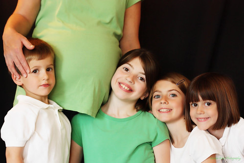
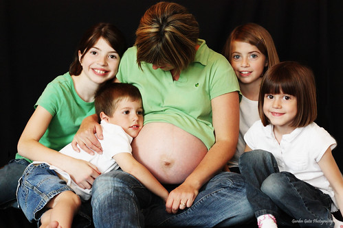
The only thing that I would change about this is to straighten the oldest's head so its not slanted. They so darn cute tho!!!
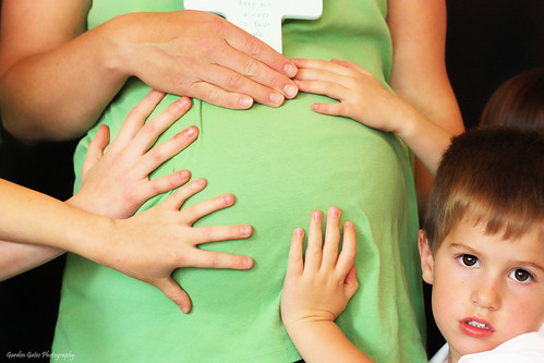
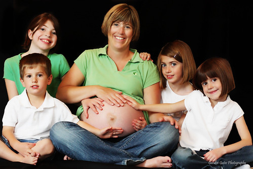
needed better hand placement. Still cute. I liked it with little brother in the shot.
Love it!
Love love love this one!! Seriously, it turned out just like I saw it in my head!
I like this one allot too!
I love everything about this picture, but there is something I cant put my finger on in her eyes. I may go back and lighten them up. Otherwise, I think its a fun shot and I like the bold colors.
I'm sure the white is almost blown(its not, I checked my info readings), but I still really like it allot.
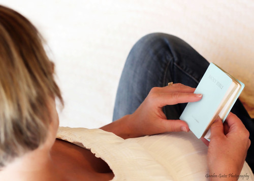
I don't know what I was thinking!! I am obviously not shooting at a direct angle on this and that is what I wanted! Arrggh. Still love it. Just eerked at myself for not looking in my viewfinder.
Like it all except the harsh shadows on the second oldest's face. Tried fixing it with a mask layer, and it looks better, but still not right.
I like this one. I love that each child is showing their own personality.
No complaints here!
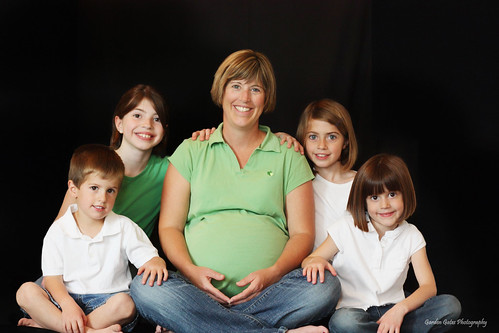
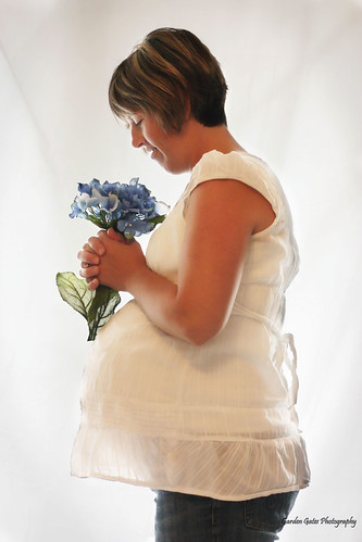
If there is anything wrong with this picture, I don't think i want to hear it! I worked this one to death because I couldn't get Mom brighter with out blowing out the background. But, I really wanted to make it happen. Two mask layers and allot of erasing. I love the composition and moms pose. The shirt is beautiful are her baby belly. I think she is gorgeous, inside and out.


2 comments:
I kept scrolling down and saying, "Oh, this is my favorite." Then "Oh this one is my favorite." And then, "oh this is the favorite." I just can't stop! These are so stinking cute! Way to go, and you're right ,she IS beautiful!
you did a good job Rhi - what an adorable family! I can't see all the pics for some reason - some aren't showing up - but what I can see I like. The family shots are especially cute and I know that they will cherish these!
Post a Comment